A polar chart is essentially an XY plot drawn on a circular grid, showing trends in values on the basis of angles. Like logarithmic scales, polar charts are useful primarily in mathematical and engineering applications.
In a polar chart, the independent variable (X) is charted on the angular axis. By default DPlot draws the origin (zero point) at three oclock. The dependent variable (Y) is charted on the radial axis, with the origin (by default) at the center of the circle.
As an example we'll walk through recreating the polar chart appearing on the Features page:
;)
This graph plots the function r=abs(sin(3f)), where f is the angular value. Select Y=f(X) on the Generate menu, which displays this dialog box:
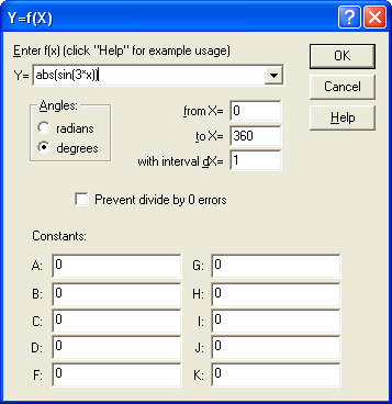
Enter the values shown above: "abs(sin(3*x))" for the function, from X=0 to 360 degrees.
;)
This initially results in a normal XY plot with linear scaling on both the X and Y axes. Right-click on the plot and select "Polar Coordinates" to get a polar plot:
;)
;)
Note that when using Y=f(X) or similar command, DPlot automatically selects the proper units for the angular values (degrees or radians). If the source of your data is a text file, data pasted from the Clipboard, or data sent to DPlot from another program, the angular values may be in the wrong units. Normally this will be obvious. For example with radians selected, our example looks like:
;)
To instead select degrees, right-click on the plot and select Polar Plot Options. Note that regardless of whether degrees or radians are selected, DPlot will display angular values in degrees with one exception: You can display angular values as multiples of or fractions of p (right-click on any of the angle values and select "Pi Multiples" or "Pi Fractions").
Privacy Policy